Brit + Co
2017-2018
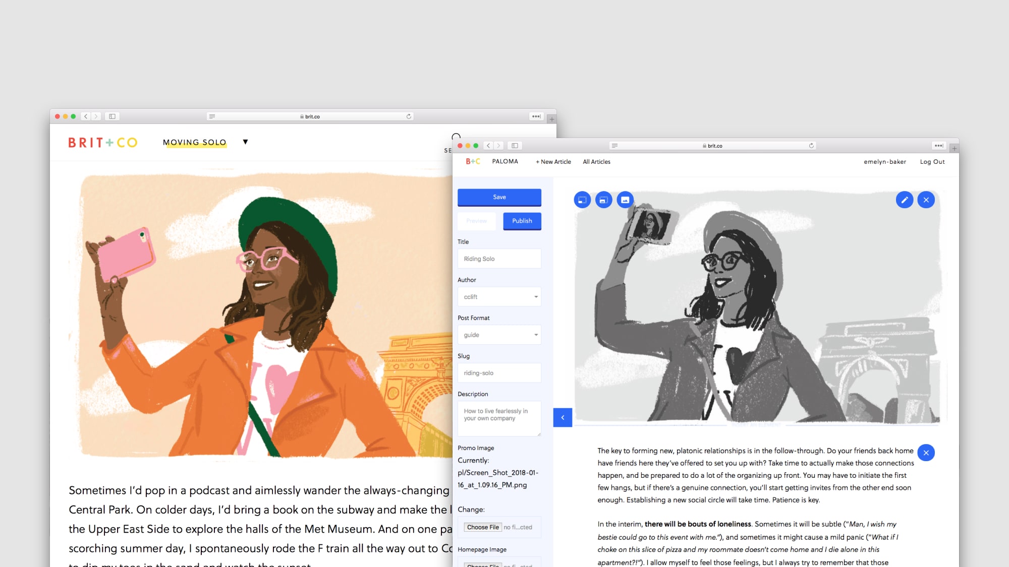
I led the design of Brit + Co's internal CMS and editor. I experimented with developing new storytelling formats, included illustrated guides and video DIYs.

I led the design of Brit + Co's internal CMS and editor. I experimented with developing new storytelling formats, included illustrated guides and video DIYs.
For several years at Brit + Co, I developed new visual storytelling experiences and spent my final year designing the CMS and editor for multimedia articles.
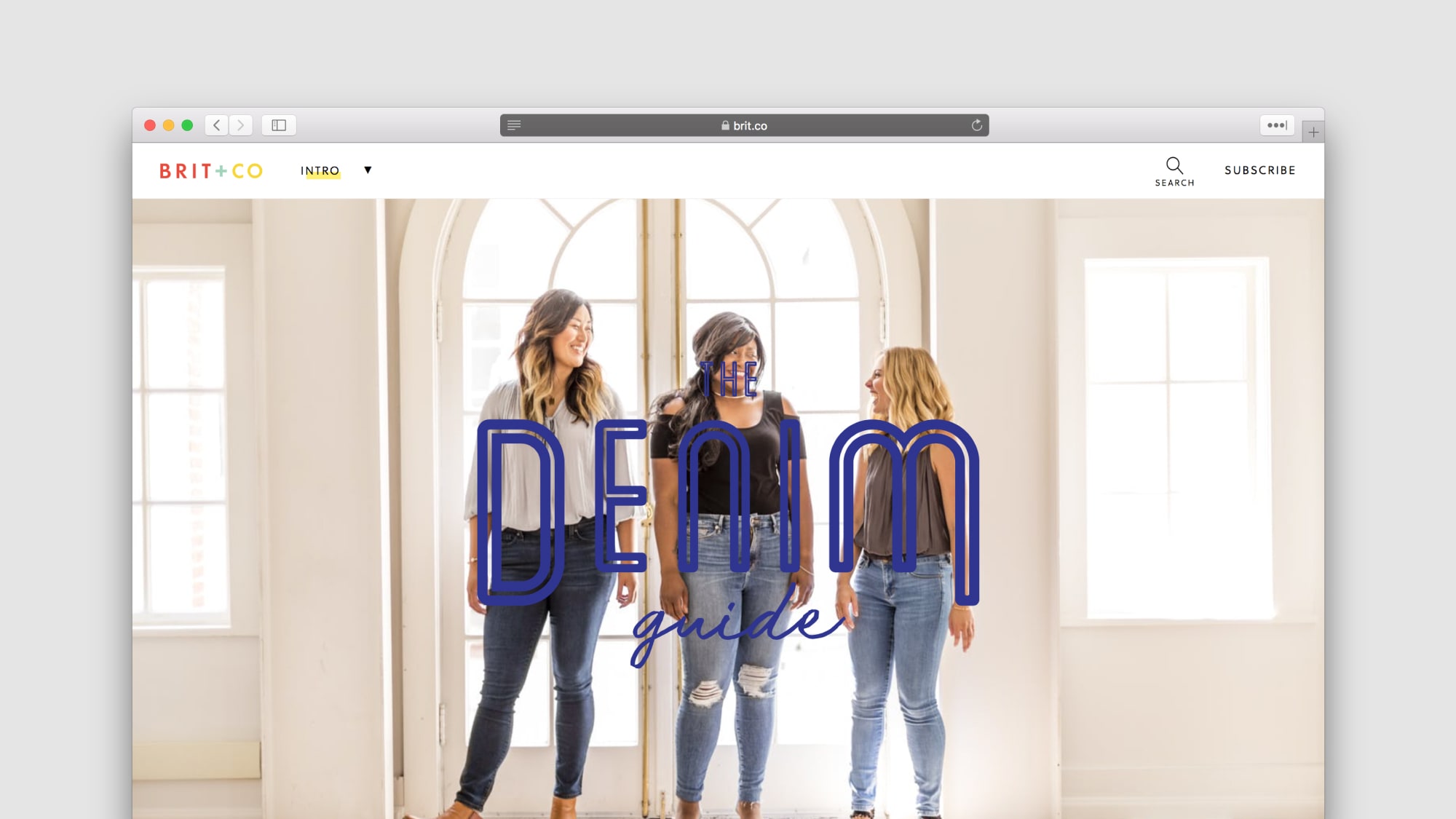
Our first experiment was creating beautiful evergreen content optimized for search engines. Articles were ranking poorly on key searches, and site performance didn't help: Brit + Co had a 67 on PageSpeed Insights. However, readers and potential brand collaborators expected a visually-rich experience, which was often weighty and slow.
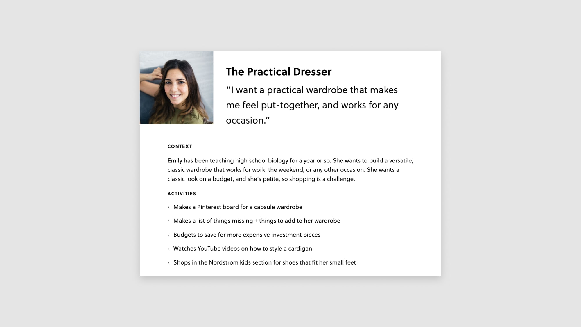
We experimented with creating a beautiful performant denim guide. Drawing from foundational research I conducted with Brit + Co readers, we imagined a comprehensive but beautiful guide on timeless fashion and beauty needs. A persona on foundational research I conducted, we knew this reader would do serious research now to make her life easier later. How might we help her go deeper on a beauty staple or new fashion trend?
We proposed rich, in-depth articles supported by beautiful multimedia presentation. I conducted a competitive analysis and contrasted results with experiences flagged by our sales team as stellar and sellable. I paired with an editorial lead to generate ideas ranging from boomerang-like GIFs to atmospheric videos. I built a desktop and mobile prototype of the denim guide in Codepen so our photo contributors and editorial staff could visualize and ideate with design and eng in real time.
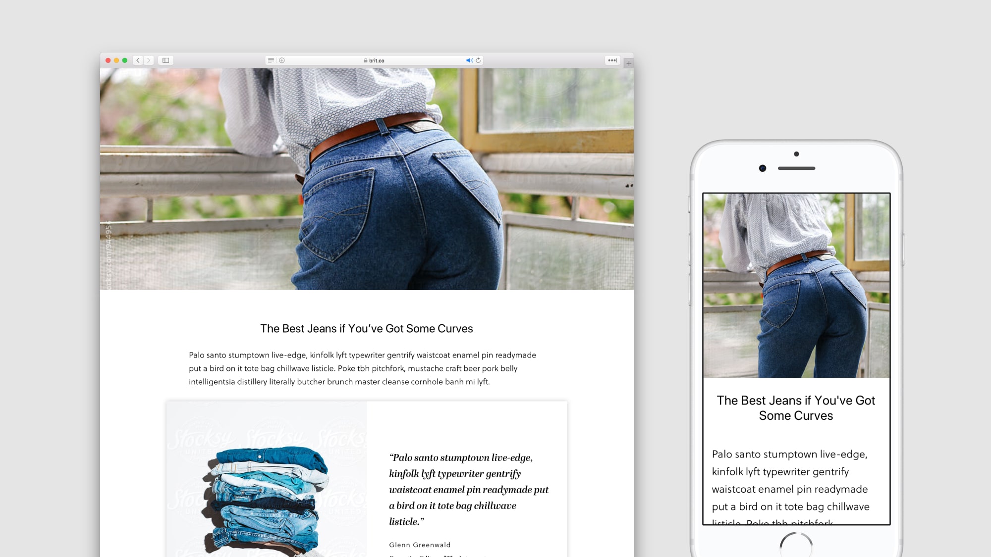
The Denim Guide launched successfully, and hit our key goals: traffic grew nicely over time, our new frontend jumped from 60 to 87 on Google's PageSpeed Insights tool, and readers loved it. But two problems arose. We heard from readers that skimming the long guide was a pain, and we heard from sales that we needed to scale our output fast.
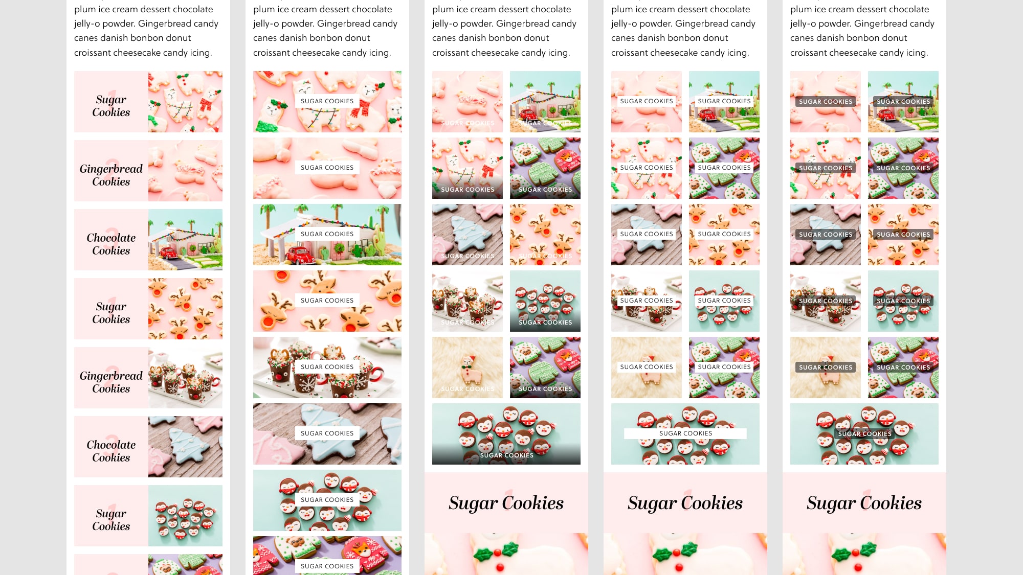
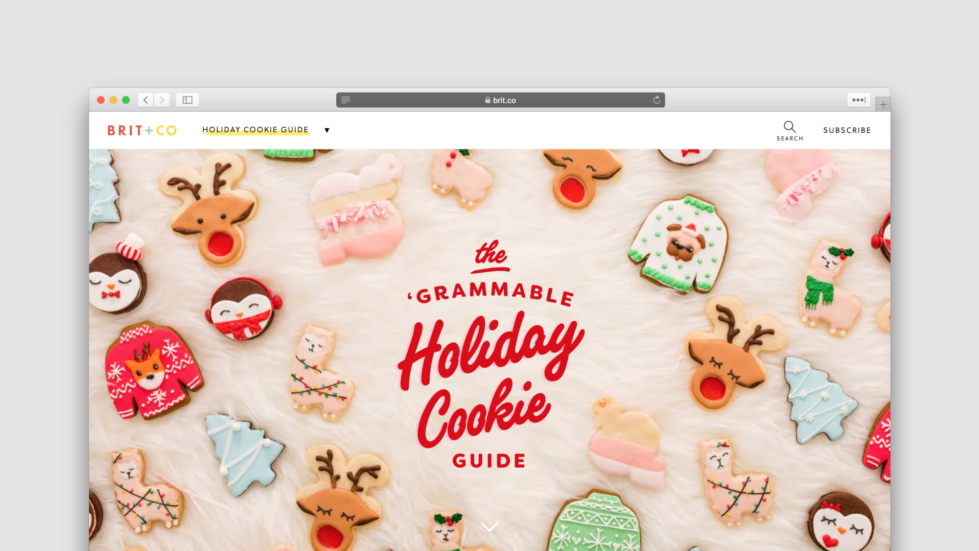
We focused on adapting a holiday cookie guide and a gift guide with these components, with success, while introducing a scrolling Table of Contents and a recipe module. The Table of Contents was a challenge of scale — four chapters grew to eleven, and forced us to design a grid layout to accommodate anywhere from 2 to 20 chapters. But ultimately, we iterated to a format that worked. Now, we needed a tool to build these articles.

Editors couldn’t produce high quality multimedia articles with Wordpress. And guides were bespoke, a one-off effort requiring a significant amount of design, engineering, and product resources. Editors were unable to tell great stories on their own, nor at scale, nor without several quarters of work. I designed the MVP and long-term vision for a new internal editing tool and CMS. How might we design an easy-to-use tool that allowed editors, designers, photographers, and videographers to collaborate and build beautiful, high quality articles together?
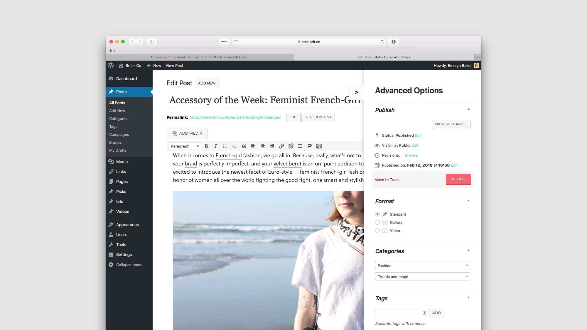
Editors wanted their work to look high quality and authoritative, but also needed to publish articles quickly. Editors wanted an article that looked great out the box, but could be further customized. And tools that helped them focus were key. Suggestions and helpers like Grammarly made things easier.
Our MVP was barebones, supporting the following:
We conducted usability testing with editors as each feature came online. It was a rough start, with poor click targets, vague input labels, and dangerously similar edit and delete buttons. We quickly added collaboration features like locking, after one editor accidentally paragraphs written by another. We also added features to support just-in-time news editors, including richer sorting features, clearer draft and scheduled statuses, and commenting and feedback features.
We successfully published our Holiday Cookie Guide, a rich multimedia experience built with our new editor tool. And now, editors are producing these beautiful, expansive articles at a greater pace than last year. Previously, one article would take a quarter or two to produce. Now, several more premium experiences have been planned or already launched for the first half of 2018.
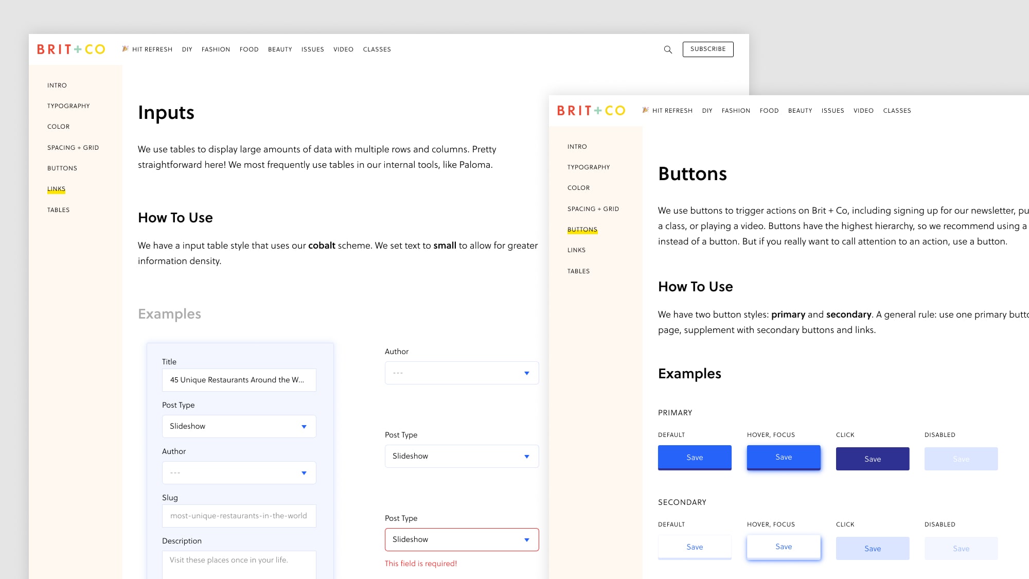
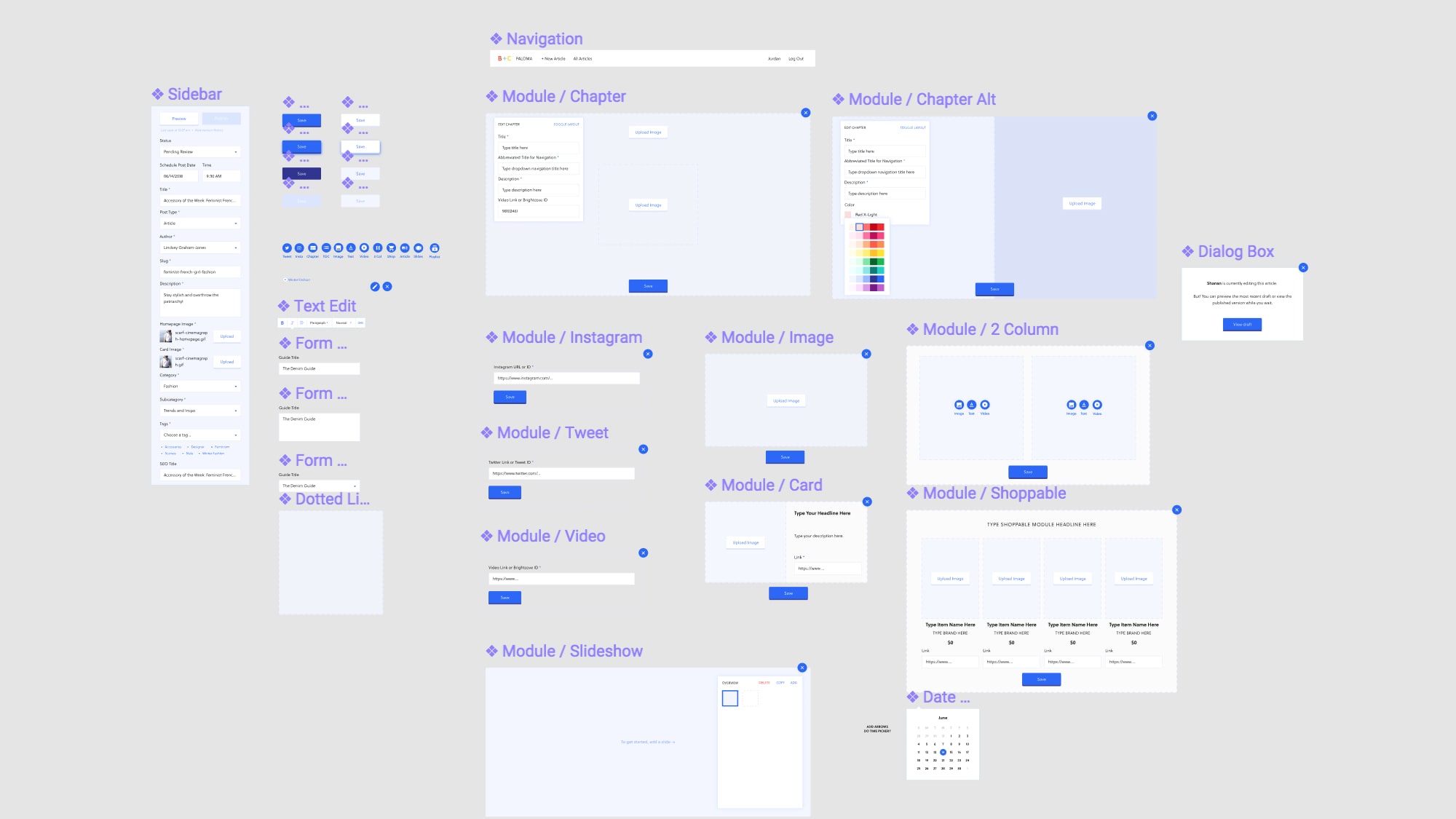
As we built the MVP, I standardized the design system and established a style guide. I outlined the information architecture and identified existing and needed components. The polished UI helped shed the MVP feel. You can see the Figma file and its evolution here.
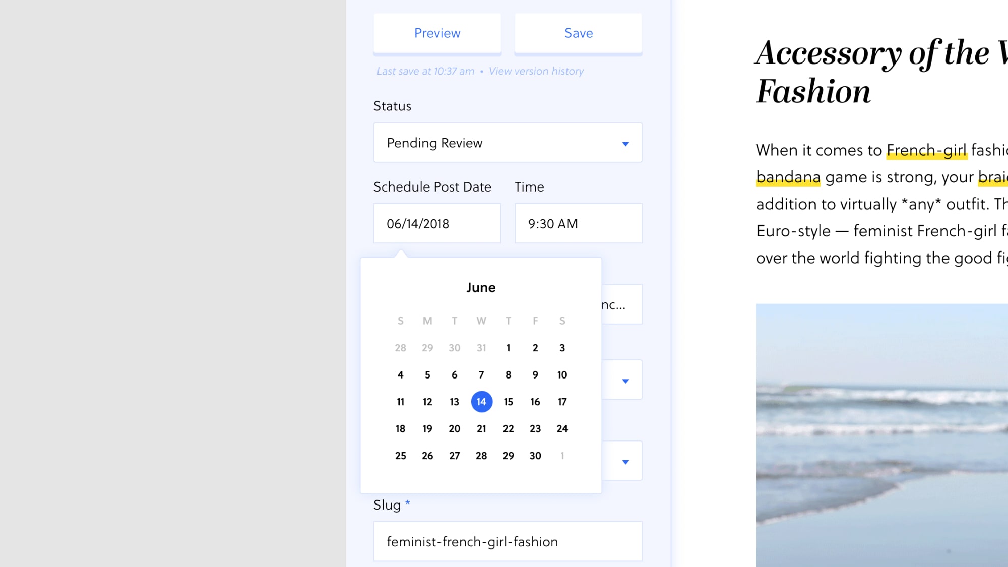
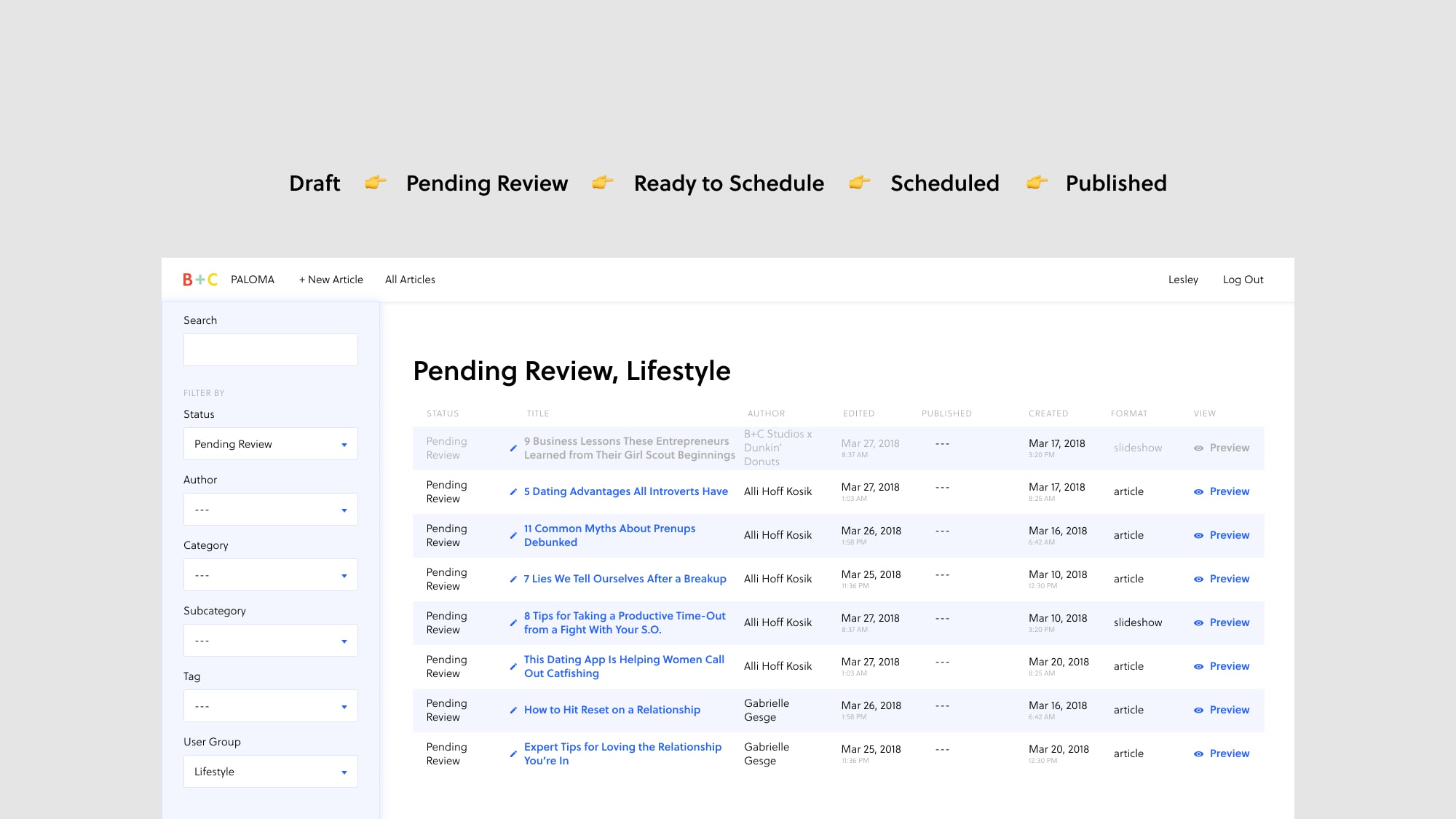

There’s one other point of success I’d like to note. This may not seem like a key component of the design process — however, it was key to helping new editors learn a new tool and feel comfortable in a new workflow.
To increase editorial tool adoption at a larger scale, I did the following:
This process built a better product. Feedback helped us create a better onboarding experience, choose more accurate labels, reprioritize features, and revamp confusing flows. Editors are producing these beautiful, expansive articles at a greater pace than last year. Previously, one article would take a quarter or two to produce. Now, several more premium experiences have been planned or already launched for the first half of 2018. And reviews have been positive, with plenty of constructive feedback. Still, one victory includes this quote from a stakeholder: “I love it. I'm obsessed with this tool.”
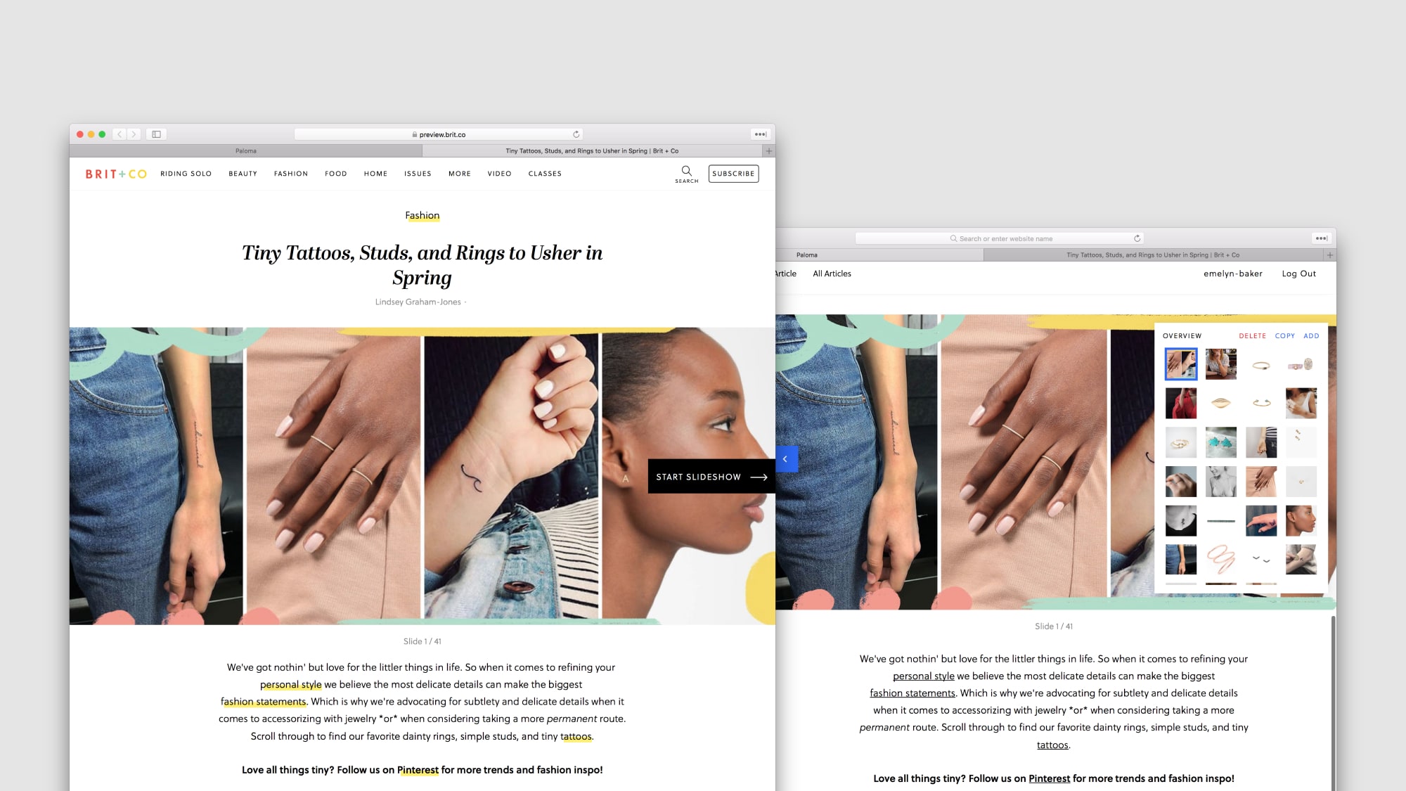
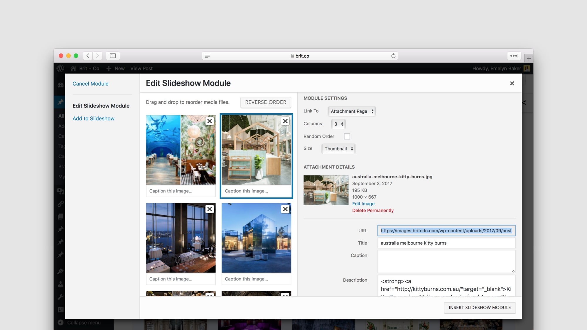
In early 2017, we launched slideshows. Engagement increased across the site and readers loved the collections of rich, beautiful photography paired with authentic storytelling. We built the slideshow tool on top of Wordpress, however, editors found creating slideshows to be a frustrating, painful process.
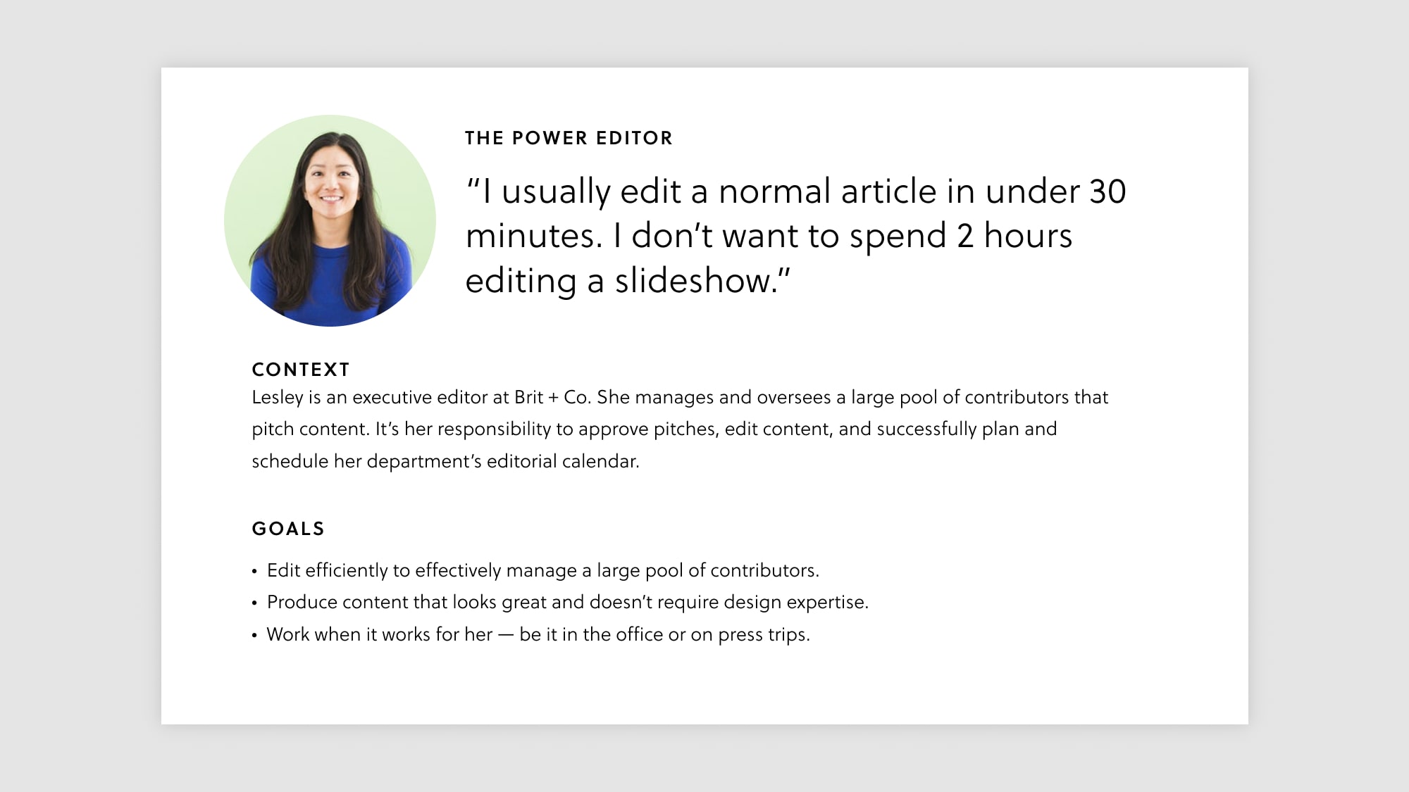
Our editor Lesley put it keenly: “I’d rather spend 30 minutes writing a basic article than spend 2 hours editing a slideshow.” Ouch.
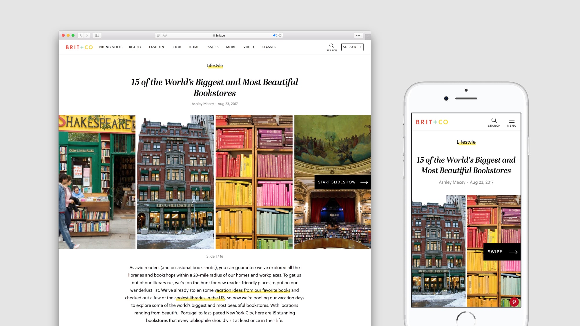
We thought we could build a better experience in our new tool, so I sat down with Lesley and 4 other editors across to see how they created slideshows. Several key themes emerged.
We explored two options with engineering, product, and editorial stakeholders. Option A offered a unique, visual way of storytelling that felt modern and contemporary. One stakeholder described this as the “Instagram stories” option. However, this option would require editors with a keen visual eye, excellent layout skills, and a willingness to put in additional time to explore a new format of storytelling.
Option B utilized the current slideshow frontend, and we could replicate current editor workflows to make the transition seamless and fast. However, slideshows would retain a more traditional look and feel.
Stakeholders loved the unique qualities of Option A, but agreed that option B would help editors create faster, wasting less time and allowing editors to create beautiful slideshows without too much required design sense.
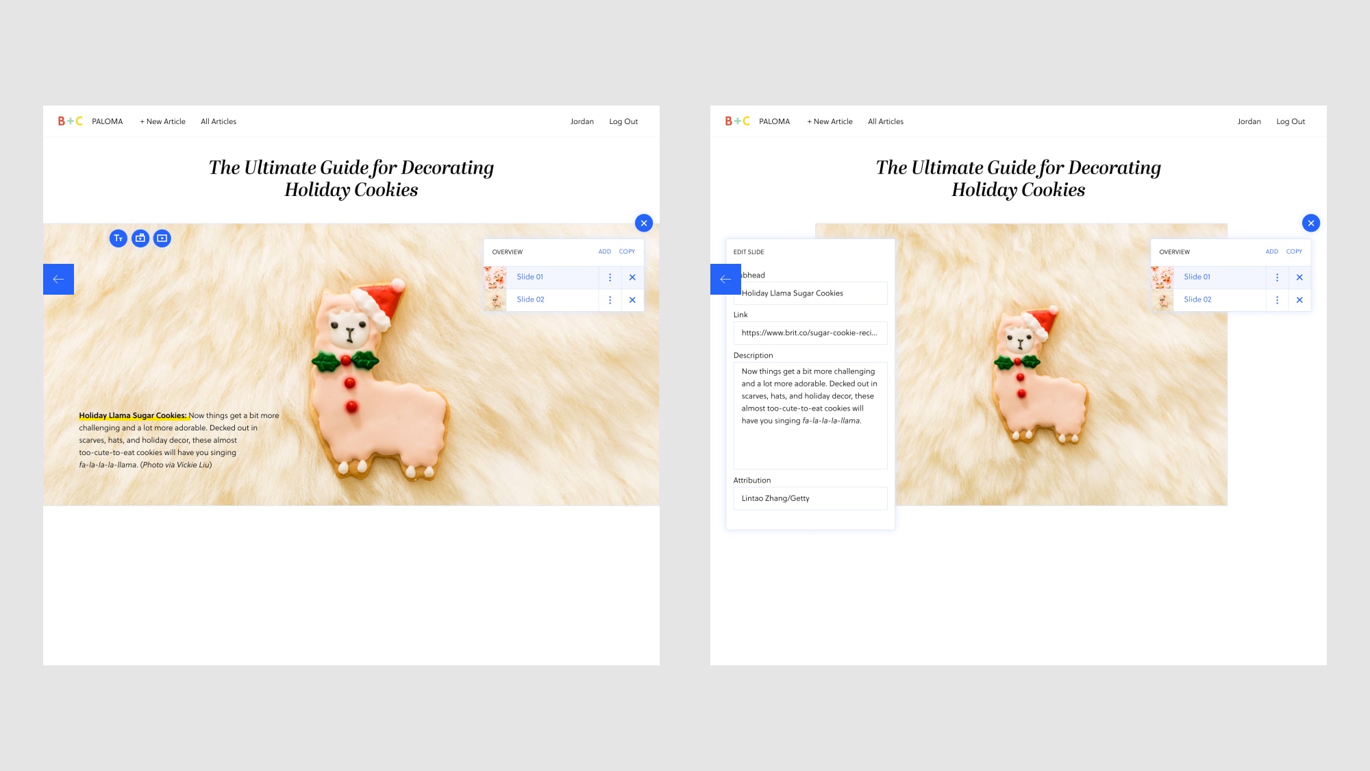
We finalized the following features for our MVP after prioritizing with stakeholders.
We launched our slideshow tool and feedback was positive, with requests. Editors wanted to open a linked article directly from the slideshow editor, keyboard shortcuts, and an affiliate link converter. Overall, initial feedback and response has been incredibly positive, with slideshow creation time decreasing.

